Category
UI & UX
Client
Revel Systems
Date Added
August 1, 2016
Project brief & details
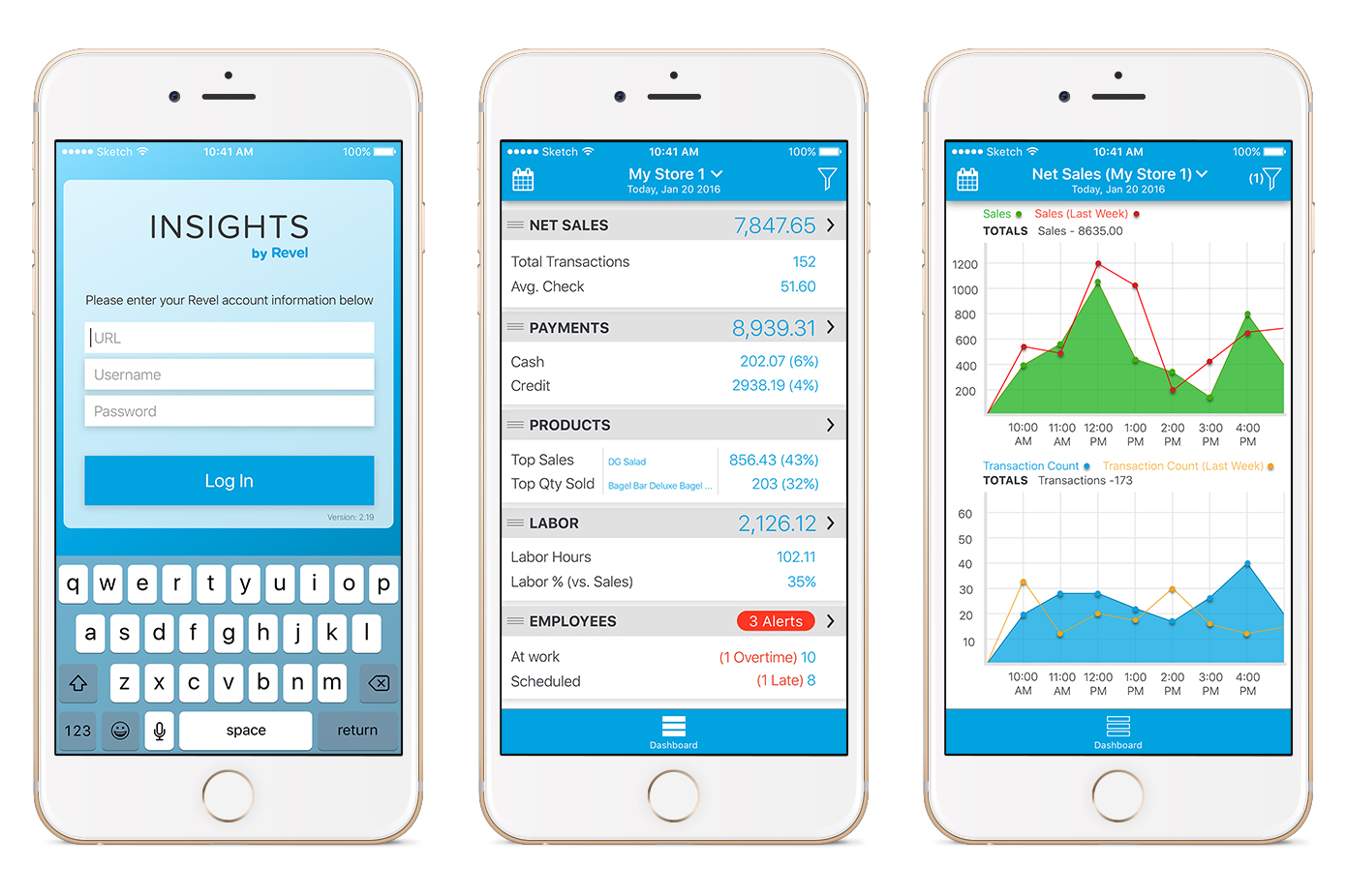
The Insights App was designed from scratch for Revel over the span of about 2 months by 1 Product Manager, 1 Engineer & myself. A previous, not-designed version of the app had been created before my time at Revel, but was depreciated upon the release of the new version. After having researched, brainstormed, wire-framed, prototyped and tested the many iterations with many business owners around the world over the web & on site, the app was released to much praise amongst Revel’s clients. The app was successful in making Revel’s users feel more secure about all operations of their business in real-time. Business owners met with the team regularly to tell us what more they’d like to see in such a tool, which allows them to monitor all their locations and business from one app.
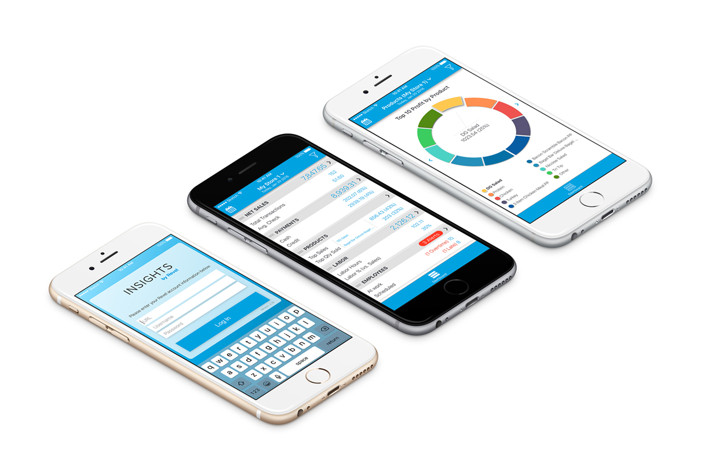
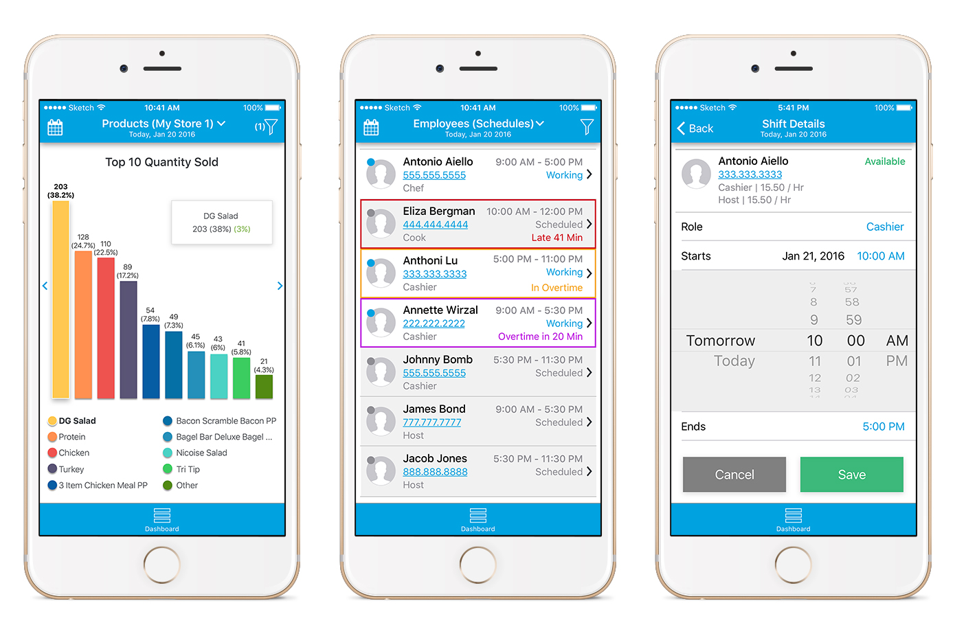
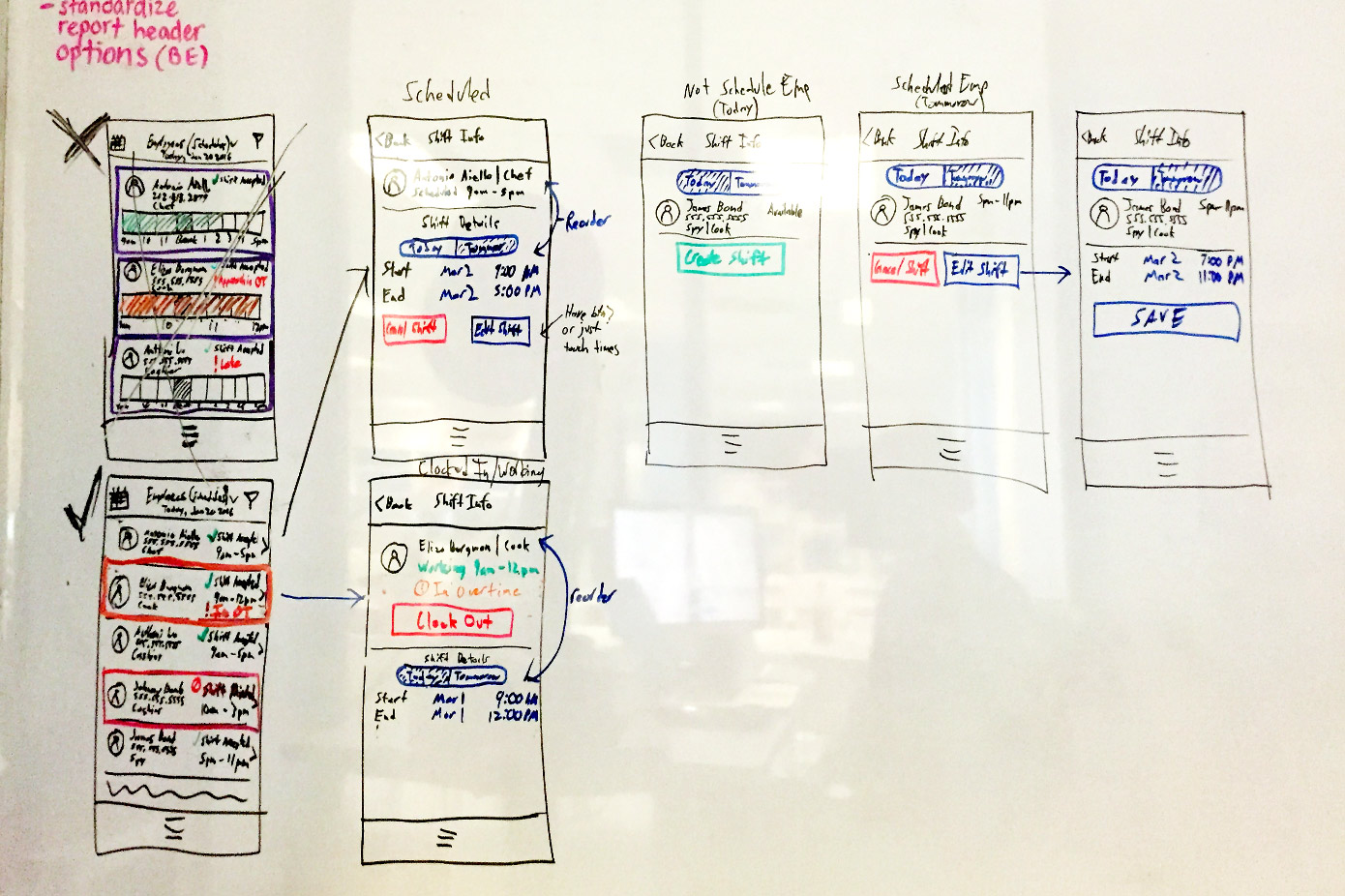
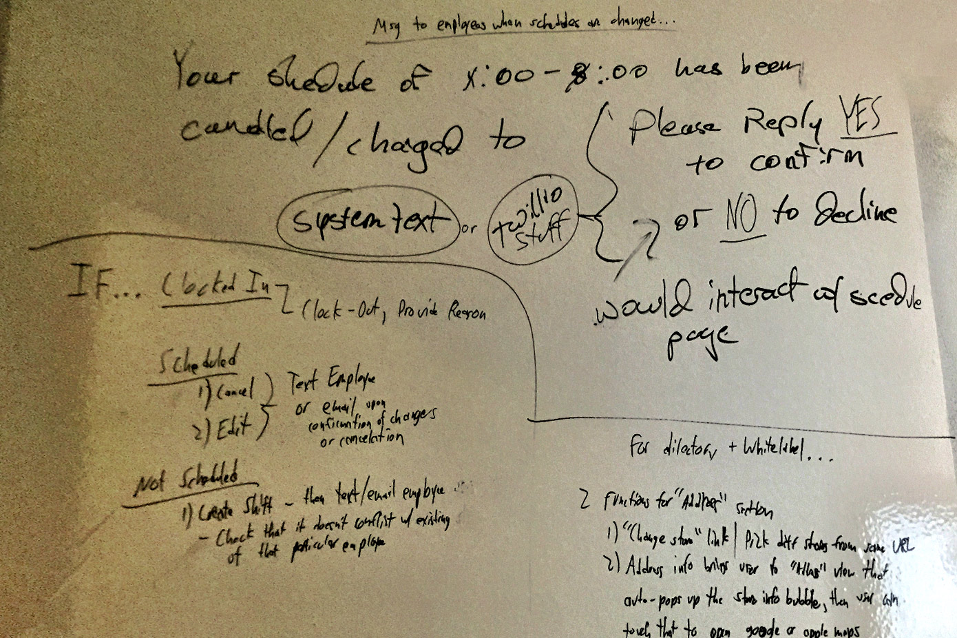
Designed with all of Revel’s clients in mind that use the Revel Point of Sale Solution for their businesses, it allows them to view and track data analytics in real time from anywhere in the world for all of their stores, right from their phone. It also allows them to schedule employee shifts, cancel shifts, call stores, text employees and managers, view net sales, see what the best selling products are and much more.
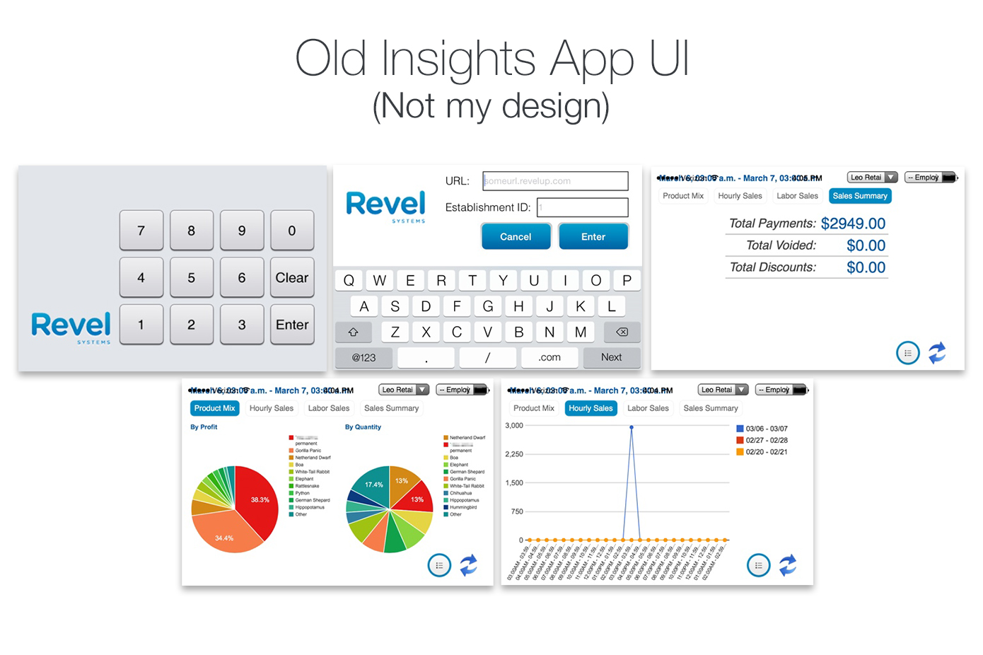
The first version of the app existed for about 3 years but was never properly designed. It was simply hacked together by the team available at the time, which was about ~20 people, but with no designers. When I started at Revel, many other higher priority items and products needed work, but eventually, our clients began to request more and more for a solution that allowed them to view their business’ data from their pockets, and not just their PC’s.
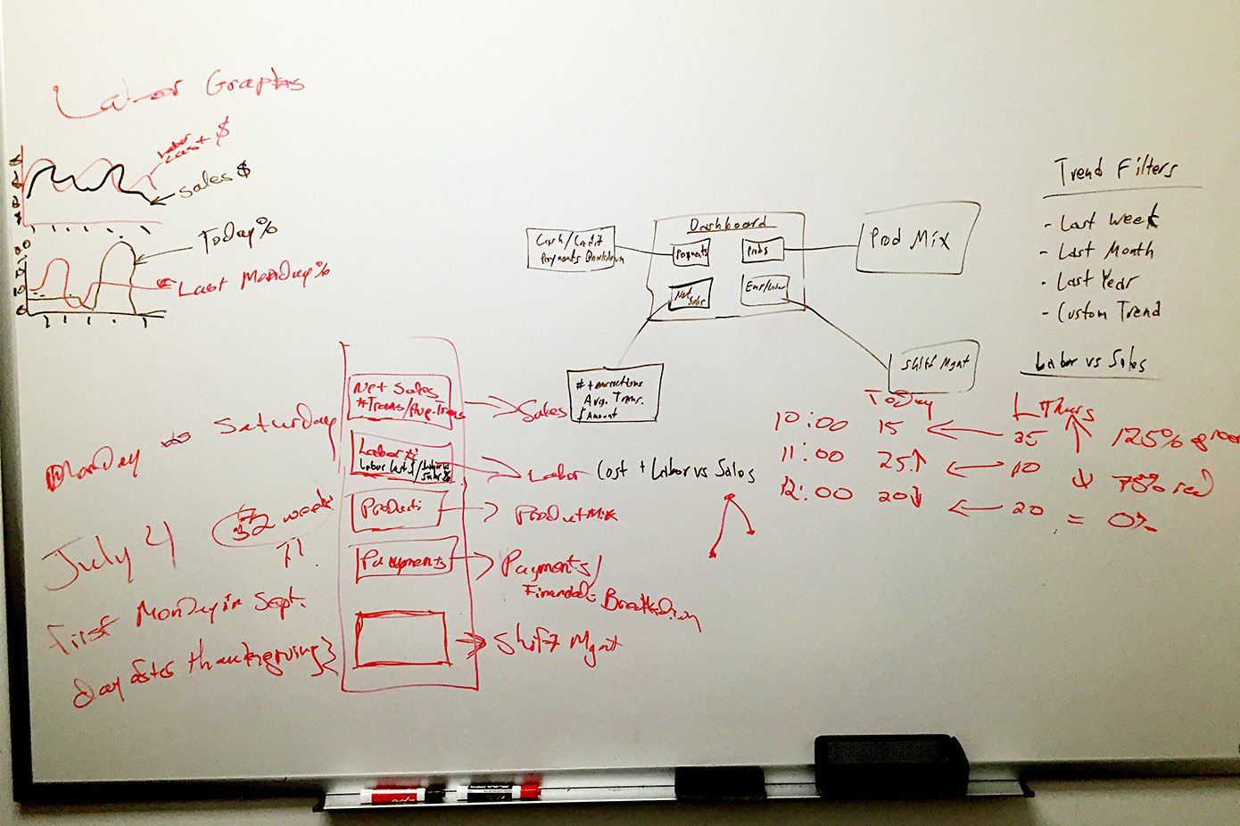
Having done some competitor studies and 1:1 user interviews of business owners who were requesting such tools, we began thinking about how to actually design this thing. What the Product Managers and I realized, was how important a clear hierarchy was. It is always important to have an easy to follow hierarchy in my opinion, but it became even more-so apparent when we began this project due to how granular one could “dig” into the data. The first iterations of the product had people very confused, simply because there was no super-clear way to go “all the way back home” from any screen. Some people became fearful the deeper they went into the app, drilling down into the granular data, to the point where they simply stopped using the app all-together.
We concluded that we needed to have a “safety net” for our users to be able to go to the Dashboard (or “Home” screen) of the app immediately. We also concluded that we needed to design something that gave the user a more secure and safe feeling in regards to the way we represented data, and that whatever they were doing is OK. The way we did this, is by evaluating why the user was more calm on one screen compared to the other. We found that screens with a very dense amount of data sometimes paralyzed users because it was truly just too much data to digest. Some of the data simply didn’t need to be exposed until necessary. Showing everything at once actually drove users away from our app, even though this is the data they were requesting to see!
With this observation in mind, we went back to design the readability of the data in a different way. We would create expandable and collapsable data columns, data that appears only after tapping specific items, and etc. In other words, keeping the data discoverable, but only exposing data that was appropriate in context.
After ideating on these problems and presenting the data in more digestible ways, we came to a solution that made our users feel secure and accomplished.